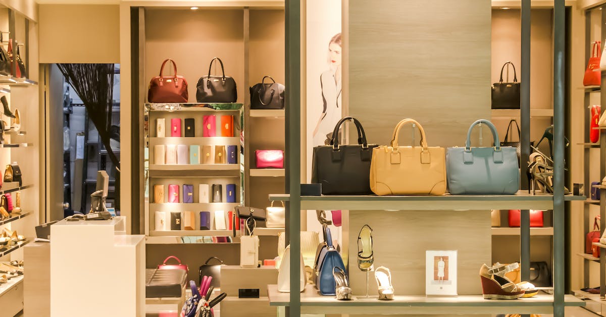
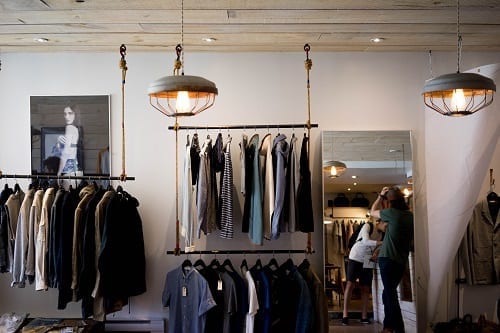
What drives a customer into a new fashion or retail store when they’re wandering through town? While they may be enticed by the products themselves, it’s often the way the products are displayed or the way the shop is organised which catches their eye and draws them inside to make a purchase.
Visual merchandising is often undermined as a sales strategy in fashion retail stores. Don’t make that mistake. The layout, appearance, and visual personality of your store are just as important as the products you choose to put in it.
Carefully curated visual merchandising can be the difference between a customer who makes repeat purchases and those who leave empty-handed, or worse, don’t feel compelled to come in at all. To help you out, we’ve rounded up the top 5 mistakes that fashion shops are making with their visual merchandising strategy.
1. Lack of consideration of the target customer
To create an effective visual merchandising strategy, it’s vital to keep the target customer in mind. This means analysing your demographic data such as customers’ age, gender, and income, but also delving deeper into their psychographics, such as likes, dislikes, and lifestyles.
Are you targeting children, teenagers, young adults, or mature? What do they seek when they come into your store? What kinds of products are they looking for at the specific time of year? By accurately evaluating your target market, you’ll be able to effectively entice them into your store.
For example, if you’re targeting young, fashion-conscious females at Christmas time, apply psychology to your visual marketing by employing a vibrant, exciting, and glamorous seasonal window display. If you’re targeting middle-aged, busy, working people, employ simplicity, organization, and cleanliness to your store layout so they can quickly and easily find what they’re looking for if they’re in a rush.
2. Under utilizing the checkout area
If people have got to the checkout area, they like your products – after all, they’re about to buy one! Use this to your advantage by making the most of the surrounding area. Use a nearby wall or space beside the tills to display a small selection of products. It’s best to focus on lower-priced products as customers are more likely to buy these on impulse. You can also use posters and signage to communicate current offers or promotions which customers may have missed.
3. No logical organisation of store layout
It’s essential to bear in mind that shoppers don’t always have much patience. Often, customers enter a store with a specific objective in mind. While you ideally want customers to browse the entire store after they’ve found the item they want, you don’t want them to give up in frustration when they can’t find what they’re looking for.
In a particularly large store, you should implement a clear, accessible store map or signage to help customers find what they need. In smaller stores, using a grouping strategy can save customers time. You could group by category, brand, use (evening wear, beachwear, casual wear, accessories), or by season. The key is to choose groups that will help customers find what they’re looking for.
4. Too few or too many products
Stocking too few products is one of the worst mistakes you can make. Large, empty spaces or obvious gaps look uninviting -and could even make your customers feel like you’re struggling or have nothing to offer. However, too many products can leave customers feeling lost or overwhelmed. To avoid this, try to establish a plan which determines what goes where and in what quantity. Make sure there’s enough free space in your store for customers to easily move around and display each product clearly and individually.
The key message? Choice is good, clutter is not!
5. Focusing on one sense instead of five
It’s a common mistake to focus on creating only a visually attractive store. Sight is easy to take advantage of with the use of lighting, themes, symmetry, colours, and attractive store decor such as mannequins. But to create a fully immersive experience, make sure to consider the other senses too.
Give your customers the ability to touch and try out whatever you’re selling, and carefully select the music you play in-store – it has a bigger effect on your customer’s behaviour than you think. For example, playing top 40 pop could encourage teenagers into your store while discouraging a mature audience, and mellow music could help people to slow down, relax and browse more thoroughly.
You’ve probably heard of global brands like Samsung, Hollister, and Sony that use ‘scent marketing’ to their advantage. Smell is closely linked to the function of your brain which controls emotion and memory, which are two factors in why a customer would choose your store over another. Why not incorporate a scent into your store and see the subtle yet effective result?
For more visual merchandising tips, tools, and advice, as well as an extensive range of display equipment products, head over to Valentinos Displays or call 01489 808007.


