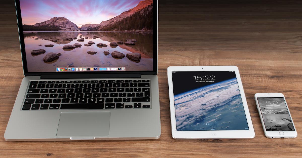
Purchasing from your favourite retail display supplier has never been easier. Today we’d like to give you a tour of the newly mobile-ready valentinosdisplays.com.
We understand if you’ve been having a hard time choosing from our wide range of products using a mobile device to view our website. At Valentino’s Displays, we wanted to offer you a faster and better shopping experience, so we have made these changes to ensure the functionality of our website doesn’t hold us back from providing you with great service.
A Better View
Our simple yet fully responsive website is now live and ready to work with any smartphone or tablet, allowing you to conveniently browse our products without tedious pinching, zooming in and pressing the wrong buttons by mistake.
It’s now been made easier than ever for you to…
- Find high-quality retail display products
- Take advantage of our bespoke services
- One-click checkout solution
- View all latest offers
- Read our blog
- Sign up for our newsletter
- …and lots more!
Instead of having to download an app to get mobile functionality like some retailers to insist on, you need only type in our usual URL in your mobile browser to enjoy the benefits of our update. If you have your smartphone with you, why not test out the features now? You can also resize your desktop browser to take a peek at the amazing results.
Our Promise
Through this new and dynamic responsive website, we hope to give our customers a better window into everything we have to offer. Our aim is to reach out directly to our loyal clients who have been missing out on the convenience of connecting with us through their mobile devices.
Feedback
We’d love to hear what you have to say, so please comment below about your experience with our new website. You can also get in touch with us through Facebook or tweet us at @vdisplays. If your site is not displaying properly, please inform us immediately at info@valentinosdisplays.com. We hope you enjoy your experience!


