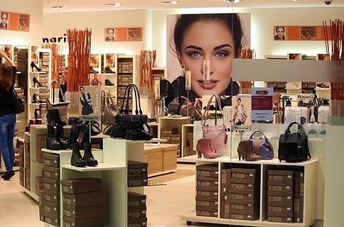
When executed correctly, visual merchandising is an incredibly effective marketing strategy for any business. However, when companies fail to utilise visual merchandising or make a mistake, it can severely impact the business and can even detract your target audience from visiting your premises. To make sure you attract customers and entice sales, you need to have a well-designed display. Make sure you avoid or rectify any of these mistakes to keep your visual merchandising working efficiently.
Most common visual merchandising mistakes
1. Windows
Many visual merchandising mistakes start with the window. Some companies will forget about their shop window while others will neglect their window display leaving it to become dusty, dull, and drab. Another problem with visual merchandising in the windows is that people will try and overfill the window to advertise as many products as possible. Unfortunately, this strategy means people are less likely to notice the product and can reduce sales.
How to fix your window visual merchandising:
- Use props to add to the theme of your window display
- Change products in the window every fortnight, and change the backdrop every two months.
- Focus on less rather than more, make sure specific products stand out
- Use the window for display, not for long-forgotten posters
- If using seasonal theming, make sure to change it when the season or event is over.
2. Offer breathing space
It is understandable that shops want to display all of their products to showcase how much choice there is and to make sure to improve upselling and add-on buying. However, by not giving customers the freedom to walk around the shop, they become fearful that they may knock something over or damage the products. Cramming products can make your shop look messy and unwelcoming.
How to fix your space and displays:
- As you introduce a new product, phase out an old one
- Offer equal space for displays
- Make sure there is adequate aisle space
- Have artwork or clean walls for customers to rest their eyes while browsing
- Where appropriate, use chairs or soft furnishings to allow customers to rest and feel comfortable.
3. Continuity
Another popular visual merchandising mistake is to come up with an excellent theme for a window, but the shop itself does not continue the theme or makes it impossible to find the products that are advertised in the window. If you have eye-catching promotional posters in the window, but customers cannot see confirmation of this deal inside the store, they may be too reluctant to ask or buy.
How to fix visual merchandising continuity:
- Make sure products in windows have a prominent place in the shop
- Use the same signage in the windows instore
- Continue your theme with decorated tables and till point
- Link point-of-sale systems to other products
- Use the same eye-catching colours or palettes.
Upgrade your visual merchandising with Valentino’s Displays
If you need to fix some visual merchandising mistakes or think your displays need an overhaul, then Valentino’s Displays can help. We offer a range of display equipment products that can help you to maximise your visual merchandising and sales potential. Browse our online shop for shops today or call 01489 808007 for free, friendly advice.


